Monday Feb 16, 2026
Monday Feb 16, 2026
Wednesday, 18 August 2021 00:00 - - {{hitsCtrl.values.hits}}

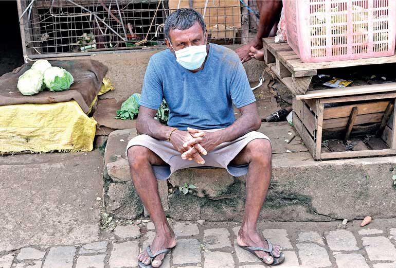
General observations show that even if it was a rich to poor spread initially, as with the previous pandemics, it is the poor countries and poor people in both rich and poor countries who had to bear the brunt of the burden of the disease – Pic by Shehan Gunasekara
 “Lies, damned lies and statistics” is a well-known old saying.
A lawyer said, “When I was a young man, I lost many cases I should have won, but as I grew older, I won many cases I should have lost; so on average, justice was done.”
Statistics is a powerful tool. Statistical misinformation is possible even in a scientifically honest investigation. The worse is manipulating statistics to convey personal biases in a persuasive manner. This is how, unfortunately, statistics came to be associated with lies.
As the COVID-19 third wave is still moving up in Sri Lanka, comparisons of Sri Lanka with India and other countries appear in news media. Based on per million population, Sri Lanka’s relative position appears to deteriorate very quickly. As of 10 August 2021, Sri Lanka’s COVID-19 deaths per million people was 243, not too far from India’s 307. In contrast, the USA recorded 1,902 COVID deaths per million population, six times more than India’s. If the case death rate (explained later) were to be used, the USA rate is only 1.3 times higher. The misinformation problem is already evident in these numbers.
Tests, cases and deaths per million population are readily available in the ‘worldometers’ website. Inappropriate use of these data could lead to highly misleading inferences. I would like to highlight some problems and illustrate with an example how the information content changes when the measurements change.
First, per million population comparison in the COVID situation does not involve comparing like with like. Just consider comparing densely populated urban Singapore with 5.7 million people with India with more than one billion people, with a large rural sector. Densely populated places report more COVID cases than less densely populated places. Per million population comparison makes more sense if Singapore is compared with countries like Denmark and Finland or cities like Delhi.
Moreover, when the population size of a country is less than one million, per million conversion can generate awkward numbers. As of 10 August, the country with the highest number of COVID cases per million population turned out to be Andorra with 191,615 cases. But Andorra’s total number of cases was 14,836. This anomalous case arises because Andorra’s population is well below one million, 77,402.
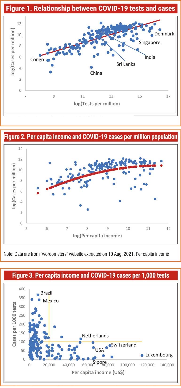
Second, the number of COVID cases diagnosed depends on the number of tests performed which in turn depends on how rich the country is. In general, rich countries have performed more tests than poor countries. For example, as of 10 August, tiny Singapore that ranked 115 in terms of total cases had performed nearly 2.7 million tests per million population whereas India, ranked 2nd in terms of total cases, had performed only about 346,000 tests per million population. Figure 1 shows the close relationship between tests and cases. (Although the numbers here are per million population, both tests and cases per million are for the same country).
Given this close relationship, a more informative measure for cross country comparison of cases would be the cases per 1,000 tests or any other desired number. Some variation of this test case rate is also possible.
Similarly, COVID deaths can be expressed as deaths per 1,000 cases (case death rate). Although we expect the death count to be more accurate than cases, there are differences across countries as to how the death of a COVID infected person with co-morbidities is classified. Nevertheless, the death count is more comparable across countries than the case count.
Both these rates can be worked out as incremental rates using data over a moving window of one week or one month. Since a death may be a result of the COVID infection few weeks earlier it is better to use cases over a longer period like one month. Again, caution should be exercised when comparing countries in upswings and downswings of the waves.
Figure 1 shows how the information content changes when the measurements change. The initial pattern of the spread of COVID-19 led some to say that it was ‘a rich man’s disease’. It was initially a high-class import, brought in mostly by well-off international travellers, then spreading in wealthier districts and neighbourhoods of different countries. But now we know, it does not care about rags and riches.
Nevertheless, a cross country plot of the number of cases per million population against per capita income shows that the rich countries, especially in the West, are still reporting more cases (Figure 2). However, when the measurement changes to cases per 1,000 tests (Figure 3) the story changes. This shows that many rich countries, those with per capita income of $ 20,000 or more reported less than 100 cases per 1,000 tests.
In contrast, a very large group of low-income countries (those below $ 20,000) have reported cases more than 100. (Seychelles with the highest incidence of 864 cases per 1,000 tests was excluded from the graph because it compresses the rest of the scatter too much.) The scatter plot of deaths per 1,000 cases against per capita income looks similar to Figure 3. These and general observations show that even if it was a rich to poor spread initially, as with the previous pandemics, it is the poor countries and poor people in both rich and poor countries who had to bear the brunt of the burden of the disease.

(The writer is Research Director of the Gamani Corea Foundation and visiting professor at the National University of Singapore.)