Thursday May 14, 2026
Thursday May 14, 2026
Monday, 19 August 2019 00:39 - - {{hitsCtrl.values.hits}}

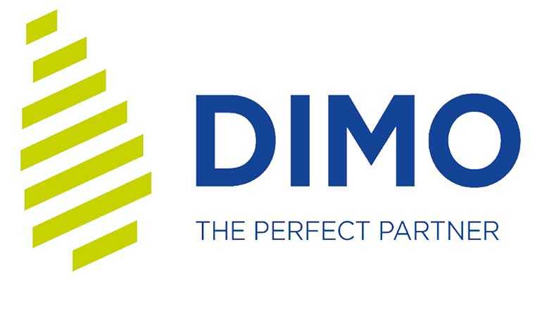
The new logo includes three elements: The geographic shape of Sri Lanka; the DIMO word mark and the new brand promise.
Shape of Sri Lanka:
As a truly Sri Lankan company, DIMO takes pride in taking their capabilities beyond Sri Lanka and by bringing in the best technologies in the world to Sri Lanka.
Seven progressive diagonal bars:
Progressive organisations focus on building a workplace around common purpose and values - giving people the energy, passion and motivation to get out of bed in the morning.
Progressive organisations act on the belief that employees are responsible individuals, who will take bold decisions and be accountable.
The seven progressive bars indicate DIMO’s areas of focus, to become a formidable progressive organisation that is relevant to the future challenges of: 1) Business, 2) Growth, 3) Technology, 4) Innovation, 5) Aspiration, 6) Globalisation, 7) World Class Services.
DIMO word mark:
Research indicated that the DIMO word needed to be a part of the new identity so that it continues a resemblance to the old identity - yet with a unique font, such that it stands out.
New Brand Promise to be “The Perfect Partner”:
DIMO’s strength and journey throughout the last eight decades have been about partnerships.
From 1939, it has continuously acquired world class principals, and managed enduring relationships whilst winning their trust. Moreover, in order to face the future challenges, DIMO wishes to be perceived as the perfect partner to all their stakeholders as they blaze trails inside and outside Sri Lanka.
New Corporate Colours:
More than just aesthetic appeal, colours help the brand connect with consumers on a deeper psychological level. New DIMO Blue and DIMO Green will connect with the emotions and associations they seek to evoke.
New DIMO Blue – Bold, Technology and Industrial
New DIMO Green – Growth, Eco-friendly, Energy and Better Life
